THE BIRD HOUSE SALON
Brooklyn, NY
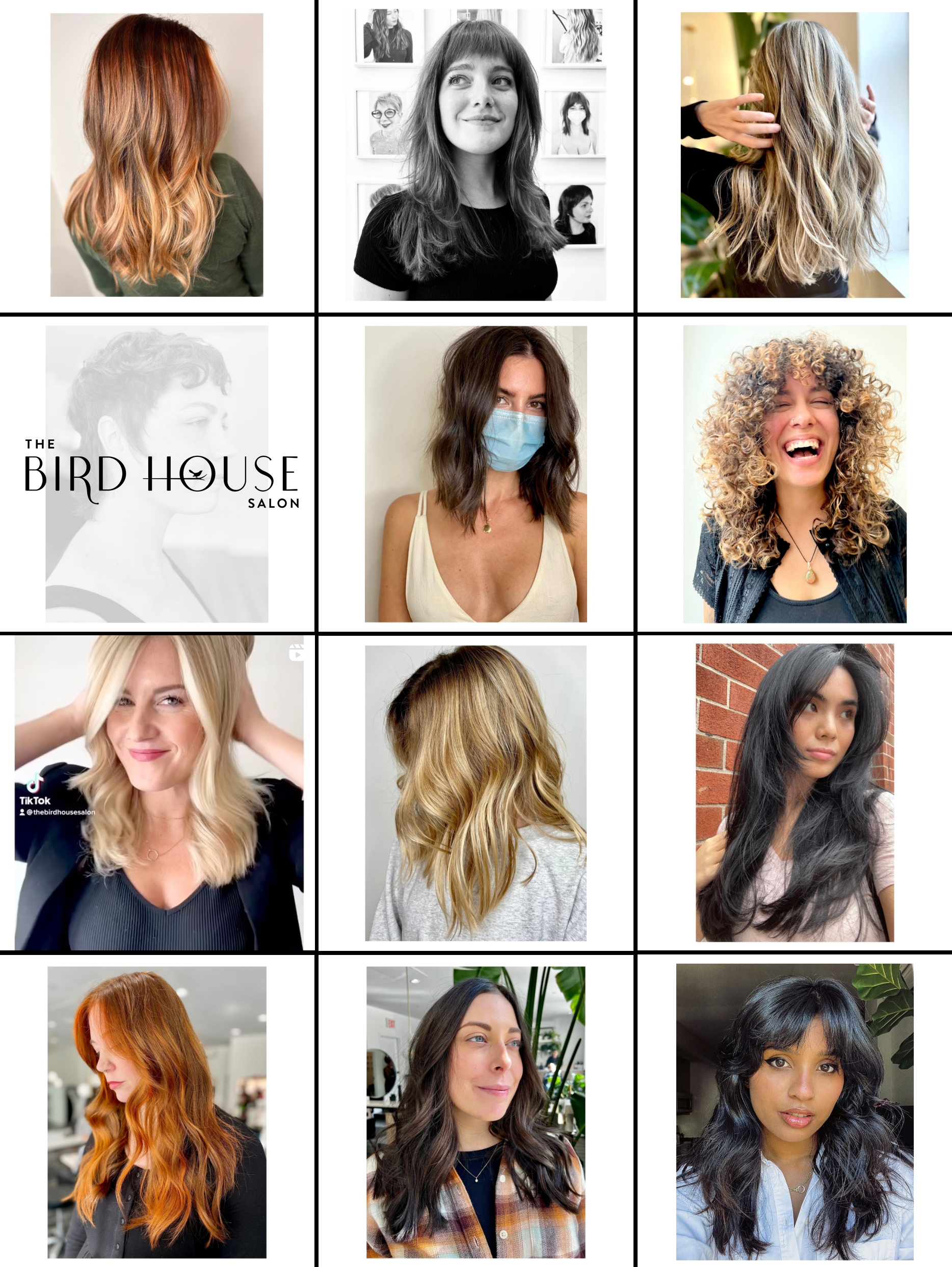
I was running the website for this salon for years, making updates when they hired new talent, updating their services menu and images and such. One day the talented Jordan Sisters (owners) started talking about rebranding the place. Their original brand was well-made and looked good; it looked feminine and was a charming brand with soft, pastel colors. They wanted to move to a more classy, black & white-only brand, still feminine but more stalwart and powerful than cute and delicate.
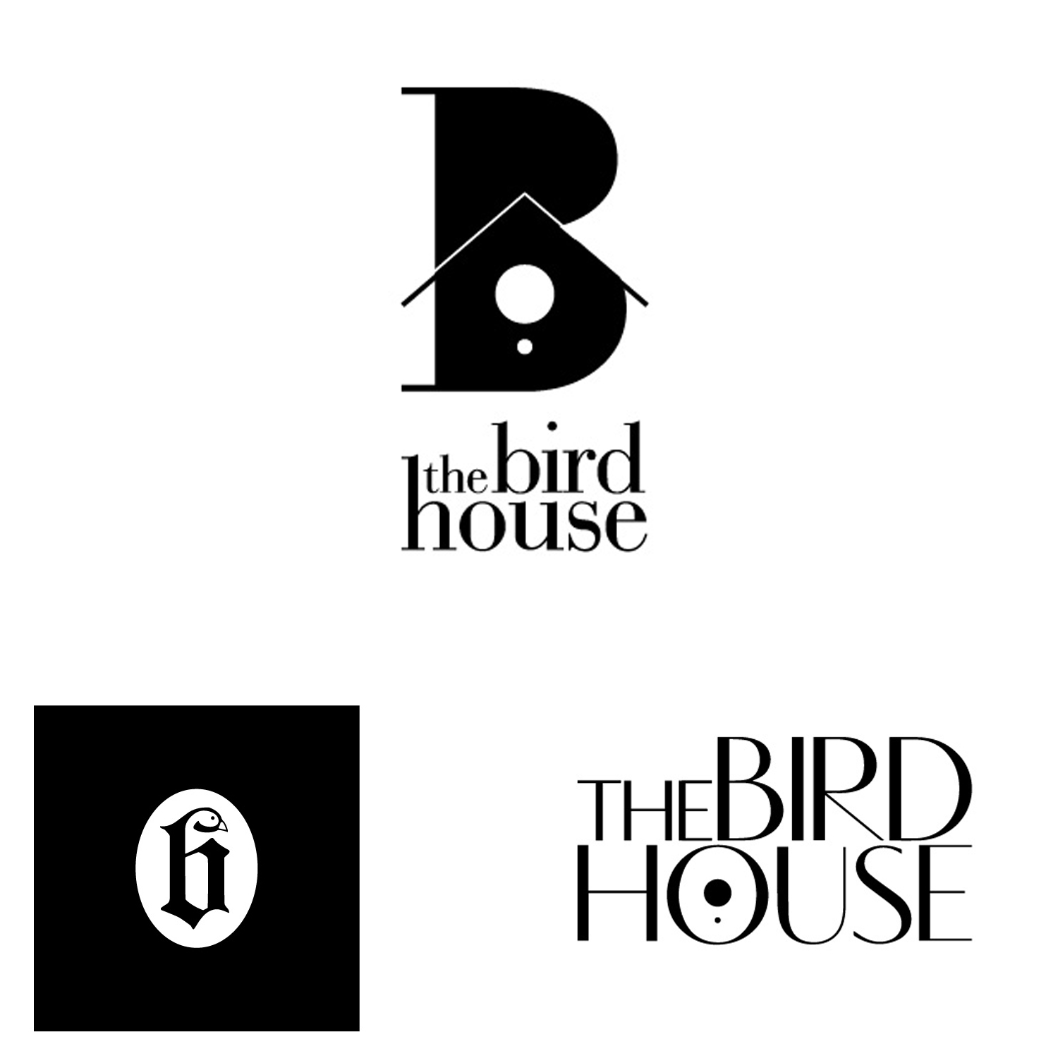
We went back and forth for a while on typography and icons that hit that mark, and none of us really loved anything 100%. I told them I was going to attempt a custom font, something I’d never done before. I had recently seen a dessert shop in an airport that had a great sign with about 6 letters on it that I thought looked great. It gave me an idea for a font that I could make with that same classy but soft, sophisticated and feminine vibe. I named it Cardinal after the bird. You can have it for free, here.
It’s a rare thing when you have an idea, and it works on the first iteration and both you and the client agree that there’s no use making anything else. I was relieved they liked it as much as I did – don’t know if I had another idea for this one that I’d like as much.
You can find a couple other doodles below.